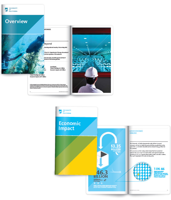
Research is often about finding ways to maximize ROI. Today's tale addresses the opposite: research as a mechanism for preventing the wrong decision.
You may have
heard the hubbub surrounding the new UC logo, designed to represent the multi-campus
collective UC system.
When NPR, The
Atlantic, and Christian Science Monitor all cover the release of a logo - that’s
right, a logo - it’s either brilliant or a disaster. And if you're reading the media coverage, this seems the sort of train wreck that makes you wonder if the design team grew cannibas in their office and baked it into free team lunches.
Here is the logo. Take a
moment to distill your impression of what it communicates, then read on.

Spoiler alert: The above image is supposed to represent a book (top half) combined
with a U (University), with an ever-evolving and flexible C for California.
Did you get that out of it? Me neither. I thought maybe the C was fading under its colossal state debt, or sinking into the ocean after an earthquake. I really want to finish coloring in the C.
In the interest of fair
disclosure, I am a UCLA alum and a masters swimmer.
So when I first saw this logo, my immediate reaction was, “Why is the
logo an image of California drowning in a wave pool? And why is it in UCLA
colors? Cal alums must be pissed.” It
turns out, the logo is flexible to varying shades of blue and yellow. And the C is neither fading nor
drowning (in water or debt), but rather “evolving.” Copy that.
It turns out I was not the
only one who saw the logo and thought it was some combination of awful and perplexing. Someone hated it so much
they started a Change.org petition to get rid of it. Within 48 hours, the petition’s
garnered more than 52,000 signatures, and a healthy dose of comments from alumni
wondering what on earth the UC Board of Regents was thinking. Consensus seems
to be that not only is this logo not particularly dignified (an expectation of
a highly regarded university system), it looks like child’s play. Literally. Nobody
seems to mind the idea of a branding exercise for the whole UC system. Everyone
seems to mind that what they came up with looks like playground art, or a Toys
R Us ad.
It also turns out: designers
hate it too. A design site gave
an oddly favorable review to this design execution, which was then met with amusingly
unfavorable feedback from the design community.
Among my favorite responses:
- “I didn't know that University of California was a children's television network.”
- “I thought at first it was a rebranding for a candy store: cute and cuddly colors and shapes. Not the kind of image I would want to be portrayed if I were an institute of higher learning.”
- “I suppose any institution could use a little "approachable" brand image, but try not to do it without losing any sense authority and/or respect. Maybe start by avoiding rounded font for your symbol?”
- “You're kidding right? Seriously. This is a joke right? It's a whale tale [sic] with a bicycle tire. It's goofy as hell.”
To be fair, there are executions of this logo that I don’t
hate. For example, it looks kind of okay if it's really small and not multi-color.
But then they had to go and turn the UC system into what
your typical 6 year old will likely mistake for an ice cream truck:
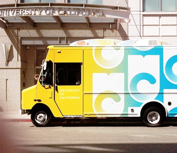
Snow cone anyone?
Some may defend this entire exercise by pointing out that
there’s a great story behind all of this creativity. There’s even a video on the above-linked review, explaining
the root of the brand exercise. (Note: The logo made more sense once I watched
the video. Unfortunately, if you need a video to explain your logo, the logo
isn’t working.) Vanessa Kanan Correa, Creative Director at the University of
California, comments on the branding objectives:
“Evoking California — and its innovative spirit — was a critical driving factor in the aesthetics across all the visual elements. We felt that what makes the University of California special is that, well, we’re in California. And what happens here impacts the world. So, we built something that was optimistic, experimental, pioneering, and bold… qualities that reflect California itself.”
I don’t disagree that California is innovative, even special.
But while our state is certainly a hub for technology, media and entertainment,
let’s not let our egos get the best of us. People change the world in
other states. Find me a New Yorker who thinks Californians are more bold than
New Yorkers, and I will give you a dollar.
Still, I like the idea that a logo can be “optimistic,
pioneering, and bold.” It's just that nobody
seems to be taking any of that away from this logo.
Which brings me to the real question at stake here: What on
earth was the UC staff thinking, and how did they come up with a logo that has
been met with reactions that range from neutral to “I’ll start giving money
again when they get rid of this nonsense”? Jason Simon, the University of California Director,
Marketing Communications, wrote the following message to Change.org, implying
that “testing” was actually done on this logo.
"The new mark was created as a part of our broader efforts to build awareness and support for all the things that UC does to make California (and by extension the world) better. What we have tried to do is to create a mark that is iconic, flexible, and solid enough that it works to represent the UC system as a whole. The mark can be used in a combination of the various UC blues and golds as well as in a multitude of applications. Seals are wonderful and carry a legacy and tradition. They also signify bureaucracy, staidness, and other not-so-great characteristics. Much of this was evident in the testing and discussion we did as part of the process."
I get the philosophy; I daresay I even like it. I also get
that there is close to zero chance this logo passed through any wave of
consumer testing.
Creative comrades, “testing” is not a discussion among your
design team. It’s not even a “which do you like better” scenario that you
bounce around the office, or throw out to your personal mailing list. “Testing” requires
understanding the implications of every
reaction. What do the colors evoke? What does the font or the style convey?
How do imagery impressions align with
expectations of the UC system? What are the opportunities for integrating the
imagery; what are the limitations? Who are the naysayers, and do they matter significantly
to the UC system?
It seems apparent that most of these questions were left
unanswered. If they’re saying that testing was done, then it was really subpar
testing. But what I think is that they probably tested their ideas, and never actually tested their executions of those ideas. I often tell clients, I don’t believe in
concept testing unless you a) have something to show people, or b) test the
ideas, develop something, and then test the executions. Otherwise it’s just
ideation, and that’s not the same thing.
This logo did get one thing quite right: blue and yellow do
evoke sky and sun – very California. Alas, it got most things very wrong: bubbly
font doesn’t convey university, and a book that looks like a whale tail or a
wave is easily confused with oceans instead of education. Not to mention, in
this modern world of Kindles and iPads, choosing the symbol of a book to
represent brand pillars such as “experimental” and “pioneering” is a
questionable strategy. One could argue that this logo aligns with SoCal, but
what about Silicon Valley, or that part of Mojave where they launch rocket ships,
or that neighborhood south of LAX where they build them?
Real ad testing, when done correctly, doesn’t just tell you
what to do. It tells you what not to do. The reality is, had UC come up with something
lackluster, nobody would have noticed. It’s because they came up with something
bad that everyone did. Let this be a lesson. When you’re prepared to budget an 11
person design team for an initiative, allegedly commissioned over a 3 year
period, you’re recklessly wasting money if you haven’t budgeted for research. Really
solid, thorough, multi-phase research.
Research isn’t just a tool for
identifying how to make money, it’s a tool for preventing costly and public mistakes.
I’ll wager a guess that the head UC publicist, not to mention every development
director at every UC university, is currently wishing someone had set aside
that investment for this endeavor.
-Kerry
ETA: As of 12/14/12, use of this UC monogram has been suspended. Let us hope that the upcoming "re-evaluation" is more thoroughly vetted this time around.
http://blogs.kqed.org/newsfix/2012/12/14/uc-suspends-use-of-new-logo/
-Kerry
ETA: As of 12/14/12, use of this UC monogram has been suspended. Let us hope that the upcoming "re-evaluation" is more thoroughly vetted this time around.
http://blogs.kqed.org/newsfix/2012/12/14/uc-suspends-use-of-new-logo/